
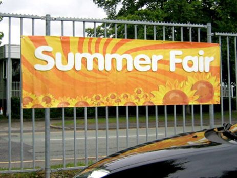
Tips For Designing the Perfect Outdoor Banner
Outdoor advertising continues to be effective despite widespread digitization and despite the widespread condemnation of advertising on outdoor banners due to the inability of assessing the efficacy of such placement, despite the widespread digitalization. However, it is only effective for 5 percent of advertisers. For the remaining 95 percent, it merely adds brightness to the city and information noise to the lives of its residents and visitors. That is no longer the case. In the event that you are considering renting a 3×6 billboard to display a banner, take a moment to review these easy guidelines, which will assist you to get the most out of banner advertising while not wasting your advertising money.

1. The principle of empty space
The more “air” on the banner, the better. Not that a 18m2 billboard allows you to stroll about and tout your specials and perks. Regardless of the size of the advertising surface, the percentage of text and visuals should remain the same. In reality, 60-70 percent of the banner should be a solid, unobtrusive background.
2. One banner – one message
Compliment the design. You make it tough for a potential client to see your poster in the city, read, be attracted, recall, and decide. He didn’t need you. So we always promote the most appealing, most “delicious” offer. Icons, labels, footnotes, and subheadings aren’t only decorative accents. False. Discard anything extraneous.
3. One banner, one visual
Don’t make a collage out of a banner. And do not add pictures to it with a huge amount of small details. It simply will not be caught, and the money will be thrown to the wind. You need ONE image to complement your special offer, and the clearer, simpler, and more concise it is, the better.
4. Content must be concise
You’ve come up with a headline that should grab everyone’s attention. Now re-read it and cut it at least twice. It should be as short as possible. In order for us to be able to make it large and for your client to have time to read it.
5. Choose font wisely
Don’t forget your target audience. A creative project is not for a designer’s portfolio. And not for you to report on a new marketing tool. It’s only for your client. So he gets the notion in seconds, don’t hinder his perception. Opt for a readable font rather than a creative one. Whenever possible, avoid using a bright font color on a bright background. Study the color wheel and the harmony of colors.
6. Branding is important
Your banner needs a logo. It should be clear, succinct, and readable. Of course, a banner with a large title and phone number can work. It’s not an investment, but a sales tool. Notoriety does not add to the “piggy bank”. If you switch your phone number tomorrow, your competition will get the same number of calls. So, in this essay, we will discuss the brand promotion, which involves insisting on a logo on the banner.
7. Set the mood
People are more likely to remember things that trigger emotions. It can be joy or surprise, open laughter, or an embarrassed smile – the main thing is that these emotions do not turn into a negative in the direction of your company. Therefore, the use of humor and provocations should be approached with extreme caution, and several times to think and consult with marketers before launching such advertising.
Conclusion
Outdoor Banners are a great way to advertise any brand. It is possible to run a year-round poster campaign. GogoAds provides outdoor banner advertising for every event. Our outdoor banners are constructed of commercial-grade vinyl imprinted on both sides and have pole hemlines at the top and bottom. We secure the base of the flag to offer the least amount of flapping. Contact us today for outdoor banner advertising of your event.
Have specific questions about your custom banner printing needs? Feel free to Contact Us.


Leave a Reply